

Mastering the Art of Interior Paint Selection: A Comprehensive Guide to Choosing the Perfect Colors
Embarking on a home transformation journey often begins with a single, exciting decision: to paint a room. Yet, the path from this initial enthusiasm to selecting the perfect paint color can quickly become overwhelming. This isn’t just about picking a shade; it’s about understanding how color influences mood, perception, and the overall ambiance of your living space. In this comprehensive guide, sponsored by the innovative minds at YOLO Colorhouse, we delve deep into the profound meaning of color in architectural design and equip you with invaluable tips to confidently choose the right hues for every room in your home.
 Architectural color is undeniably one of the most exciting and impactful elements in any remodeling or redecorating project. However, it can also be the most intimidating aspect for many homeowners. The simple act of painting a wall possesses an incredible power: it can instantaneously alter the entire feel of a space, often with a relatively low investment compared to other renovation efforts. This accessibility makes color an incredibly potent tool in interior design, capable of transforming a mundane room into a vibrant sanctuary or a serene retreat.
Far beyond mere aesthetics, color serves a multitude of functional purposes. It can create seamless flow between different areas of your home, infuse a room with unique character and personality, subtly direct foot traffic, or brilliantly highlight architectural details that might otherwise go unnoticed. Imagine using a striking color to draw attention to a beautiful fireplace or a unique ceiling fixture. Color can also act as an inviting force, pulling people towards communal gathering spots like kitchens or living rooms, fostering connection and conviviality. Conversely, it can imbue private spaces with a profound sense of tranquility and relaxation, perfect for bedrooms and bathrooms. Truly, understanding and utilizing color effectively is a powerful skill in crafting environments that resonate with purpose and emotion.
The Dynamic Nature of Color: Ever-Changing, Always Inspiring
One of the most fascinating and sometimes challenging aspects of color is its inherent inconsistency. While we perceive colors as static, in reality, they are constantly in flux, influenced by a myriad of external factors. Light, the surrounding space, and other colors in close proximity continuously alter how a particular hue is perceived. A color that looks vibrant under natural daylight might appear subdued or even different under artificial light. This dynamic quality is precisely what makes color so exciting; it adds layers of depth, focus, and visual interest to both living and work spaces, preventing them from feeling monotonous. The journey of choosing color, from the initial spark of inspiration to the final brushstroke on the wall, is an exhilarating endeavor, promising a personalized and evolving aesthetic experience.
Essential Tips for Choosing Your Perfect Paint Palette
Navigating the vast spectrum of available paint colors can feel like a daunting task. To simplify this process and empower you to make informed decisions, consider these crucial tips and factors that influence how color behaves in your home.
1. The Profound Influence of Light: Natural vs. Artificial
The single most significant factor in how a paint color will appear is the light source it is exposed to. Color is never truly static; it dances with the light, transforming throughout the day and night.
- Natural Light:
- North-Facing Rooms: These rooms tend to receive cooler, more subdued light. Colors here might appear darker and duller. To counteract this, consider warmer, brighter colors to infuse life and warmth.
- South-Facing Rooms: Bathed in abundant, warm, and bright light throughout the day, these rooms can handle cooler tones without feeling cold. Warm colors here might appear even more intense.
- East-Facing Rooms: Enjoy beautiful, warm morning light that gradually shifts to cooler, bluer tones in the afternoon. Colors will look different depending on the time of day.
- West-Facing Rooms: Receive cooler morning light, transitioning to intense, warm afternoon and evening light. This can make colors shift dramatically from morning to evening.
For instance, a seemingly pristine white wall can take on a greenish cast due to reflective light from a vibrant lawn or grass outside, or it might lean blue if there’s a bright blue house or sky reflecting nearby. Always observe how natural light impacts your chosen shade throughout the day.
- Artificial Light: Different types of artificial light bulbs also have a profound effect:
- Incandescent Light: Emits a warm, yellowish glow that can make colors appear softer and warmer.
- Fluorescent Light: Often casts a cool, bluish-green hue, which can make colors appear harsher or alter their true shade.
- LED Light: Varies greatly depending on its color temperature (warm white, cool white, daylight). Always test your paint under the specific LED lighting you will use in the room.
The color will also change from wall to wall within the same room and certainly from room to room, creating a unique character in each space. Always test colors in the specific environment where they will be used.
2. The Fifth Wall: Don’t Forget About the Ceiling
Who said ceilings must always be white? Breaking away from this traditional convention can introduce an unexpected layer of drama and sophistication to your interior design. The ceiling, often referred to as the “fifth wall,” presents an incredible opportunity to extend your color palette and create a truly immersive experience. Dining rooms, bedrooms, and powder rooms are exceptional spaces to experiment with ceiling color. Imagine a deep, rich hue on a dining room ceiling that creates an intimate, jewel-box effect, or a soft, calming shade in a bedroom that enhances relaxation. A colored ceiling can make a large room feel cozier or add an intriguing focal point to an otherwise simple space. Don’t be afraid to look up for inspiration!
3. Harnessing Color Psychology: Warm vs. Cool Hues
Colors have an innate ability to evoke specific emotions and influence the psychological atmosphere of a room. Understanding basic color psychology can guide you in selecting hues that align with the intended function and mood of each space.
- Warm Colors (Reds, Oranges, Yellows):
These vibrant hues are often described as “people-magnets.” Warm colors are energetic, stimulating, and tend to advance visually, making a space feel cozier and more intimate. They are known to increase appetite and encourage conversation, making them perfect for rooms where social interaction is key. Use these inviting colors in areas where you want people to gather, converse, and feel lively, such as kitchens, dining rooms, and lively living areas. A bold orange accent wall in a dining room can stimulate conversation, while a warm yellow in a kitchen can infuse it with sunshine and cheer.
- Cool Colors (Blues, Greens, Purples):

In contrast to warm colors, cool colors promote feelings of peace, tranquility, and serenity. These hues tend to recede visually, making a space feel larger, more open, and calming. They are excellent choices for rooms dedicated to relaxation, reflection, or sleep. Integrate cool colors like gentle greens and soothing blues in bedrooms, bathrooms, and home offices where focus and calm are desired. A soft blue in a bedroom can create a serene sleep sanctuary, while a muted green in a bathroom can evoke a spa-like retreat.
- Neutrals (Grays, Beiges, Whites):
While not explicitly mentioned in the original, neutrals are foundational to many palettes. They provide a calm backdrop, allowing other elements of a room (furniture, art) to shine. Neutrals can be warm or cool, depending on their undertones, and are incredibly versatile for creating sophisticated and timeless spaces.
4. The Importance of Sheen and Finish
Beyond color itself, the paint’s sheen (or finish) dramatically impacts its appearance and durability. Different sheens reflect light differently and are suited for various areas:
- Matte/Flat: Offers a non-reflective finish that hides imperfections well. Ideal for low-traffic areas like dining rooms and master bedrooms. Less durable and harder to clean.
- Eggshell/Satin: Provides a soft sheen, more durable and easier to clean than flat. Excellent for living rooms, hallways, and kids’ bedrooms. Satin is slightly shinier than eggshell.
- Semi-Gloss: Highly durable and easy to clean, making it perfect for high-traffic areas, kitchens, bathrooms, trim, and doors. Its higher reflectivity can highlight wall imperfections.
- Gloss: The most durable and reflective finish, often used for furniture, cabinets, and decorative accents. It offers a dramatic, modern look but requires very smooth surfaces.
5. Creating Flow and Harmony Between Rooms
Consider how colors will transition from one room to another, especially in open-concept living spaces. A cohesive palette doesn’t mean every room has to be the same color, but rather that the colors chosen complement each other, sharing similar undertones or belonging to a harmonious family. This creates a sense of continuity and makes your home feel thoughtfully designed and integrated.
6. Integrating Existing Decor and Furnishings
Unless you’re planning a complete overhaul, your new paint color needs to harmonize with existing furniture, artwork, flooring, and textiles. Bring samples of fabrics or pictures of your key pieces when choosing paint. This ensures that the new wall color enhances rather than clashes with your current decor, tying the entire room together beautifully.
Practical Steps to Your Perfect Paint Palette
With an understanding of color theory and influencing factors, let’s outline a practical approach to selecting your ideal paint colors.
1. Gather Inspiration and Build a Mood Board
Before even looking at paint chips, gather inspiration from magazines, Pinterest, Instagram, or even nature. Create a mood board that includes images of rooms you love, fabric swatches, furniture styles, and art pieces that resonate with your desired aesthetic. This will help clarify your vision and identify recurring color themes.
2. Understand Undertones
Every color has an undertone—a subtle base color that influences its overall appearance. For example, a gray paint might have a blue, green, or even purple undertone. Understanding these subtle nuances is crucial, as they dictate how a color interacts with other elements in your room. If your furniture has warm yellow undertones, a cool blue-gray paint might clash, while a warm gray with a beige undertone would harmonize beautifully.
3. The Critical Step: Testing Paint Samples
Never commit to a color based solely on a small paint chip. Purchase sample pots of your top contenders and paint large swatches (at least 2’x2′) directly onto your walls, or on large white poster boards that you can move around the room. Paint two coats to get a true representation of the color.
4. Observe Through the Day and Night
Once your samples are on the wall, observe them at different times of day—morning, midday, and evening—and under various lighting conditions (natural light, overhead lights, lamps). Watch how the color changes as the light shifts. This step is non-negotiable for making an informed decision.
Introducing YOLO Colorhouse: Your Partner in Palette Perfection
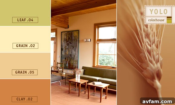
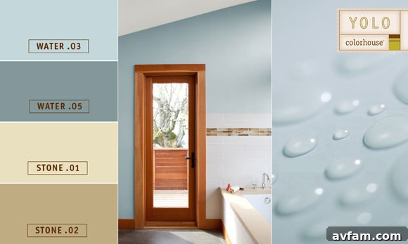
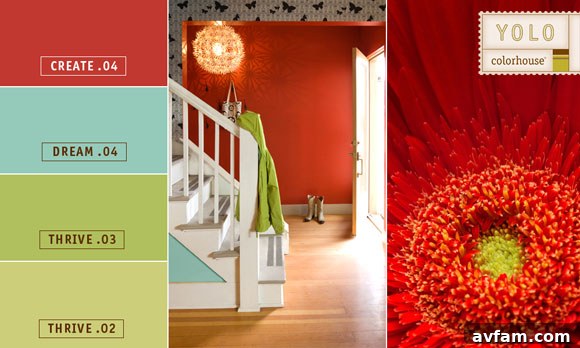
In your quest for the perfect paint, YOLO Colorhouse stands out as a brand dedicated to creating stunning, eco-friendly palettes designed specifically for interior spaces. With a curated collection of 92 thoughtfully developed hues, YOLO Colorhouse simplifies the color selection process, ensuring you can easily choose colors that will create an effortless flow and enduring harmony throughout your entire home. Their philosophy centers on making beautiful, sustainable color accessible and inspiring.
Their collections are ingeniously structured to guide your choices:
- The Easy-to-Live-With Earth’s Color Collection: This popular collection is comprised of soothing hues directly inspired by the natural world around us. Think of the serene greens of a forest, the calming blues of the ocean, or the grounding browns and grays of earth and stone. These colors are designed to create tranquil and grounding environments, promoting a sense of peace and connection to nature within your home. They are perfect for those seeking a harmonious, understated elegance.
- The Colors of Hope: For those who crave vibrancy and a spark of energy, this collection offers brighter and bolder hues. These dynamic colors are specifically designed to energize the human spirit, infusing spaces with optimism and vitality. They are an excellent choice for modern homes, creative studios, or commercial spaces where a strong, contemporary statement is desired. Imagine a vibrant coral in a home office to spark creativity, or a confident turquoise in a lobby to welcome guests with a burst of cheer.
- The Sprout Collection: Tailored for the newest members of your family, this delightful group features gender-neutral hues designed to create dreamy, calming sleepscapes and playful environments for life’s newcomers. Soft lavenders, gentle mints, and serene creams provide a nurturing backdrop for nurseries and children’s rooms, growing with them through their early years.
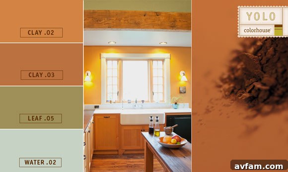
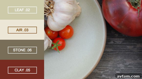
Beyond these structured collections, YOLO Colorhouse also offers incredibly inspiring food-inspired palettes, which are absolutely fantastic for any kitchen or eating space. Imagine the rich, earthy tones of a gourmet meal translated onto your walls, creating an inviting and delicious atmosphere.

Need Help Choosing Color? Expert Assistance is Available!
The journey to finding your perfect color doesn’t have to be a solitary one. YOLO Colorhouse provides exceptional resources to assist you every step of the way:
- Play with Different Color Combinations: Utilize the interactive YOLO Colorhouse Select-A-Color tool. This online platform allows you to experiment with various hues and see how they might look together, helping you visualize your choices before committing.
- Access FREE Online Color Help: Take advantage of their invaluable FREE online color consultation service. Simply let them know which rooms you need assistance with, upload some photos of your space, and one of their experienced color experts will promptly email you back a personalized, suggested color palette tailored to your specific needs and preferences. This professional guidance can make all the difference in achieving a truly harmonious and beautiful result.
Conclusion: Embrace the Power of Color in Your Home
Choosing the right paint color for your home is an art and a science, a journey of discovery that culminates in a space that truly reflects your style and enhances your daily life. By understanding the dynamic nature of color, considering the profound impact of light and psychology, and following practical steps for selection, you can transform your home with confidence. Remember, color is an incredibly powerful tool that can create flow, define character, and set the perfect mood for every room. With resources like YOLO Colorhouse and their expert support, the intimidating task of color selection becomes an exciting adventure, promising a beautifully colored home you’ll love for years to come. Don’t just paint your walls; color your life!