
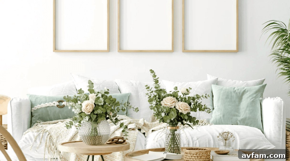
A living room wall filled with personal art can look intentionally curated or like a random collection of pieces stuck wherever there was space. The difference usually comes down to planning and attention to detail rather than the artwork itself.
Custom framing gives you control over finish, mat, glass, and overall size, making it easier to choose frames that harmonize with the room instead of treating art and décor as separate decisions. Below are practical tips to help those details work together to create a cohesive, attractive living room display.

Match Frame Finishes to Existing Decor
Begin by surveying what’s already in the room. Frame choices tend to follow the same design principles regardless of the space. Warm wood frames echo timber finishes such as coffee tables, shelves, and floors. Dark walnut creates contrast on light walls, while oak or lighter woods blend softly into a minimalist palette without competing with larger furniture pieces.
In modern interiors, metal frames can be especially effective. Brass or nickel can pick up the tone of lamp bases, cabinet hardware, or other metal accents, while slim aluminum frames suit abstract prints and posters. Exact matches aren’t necessary; repeating a material or finish once or twice elsewhere in the room is usually enough to make the frame feel intentional.
Plan Placement Around Architecture and Scale
Scale is easy to misjudge from a photo or product image. Something that looks substantial in a store can appear lost on a tall wall. Before drilling, test layouts in the actual room.
A simple and reliable trick is to cut kraft paper or newspaper to the size of each frame and tape the sheets to the wall. Live with the arrangement for a day and view it from the sofa, doorway, and any adjoining areas. This will quickly reveal whether a piece feels too small, too high, or disconnected from nearby furniture.
Ceiling height affects composition:
- High ceilings: Vertical arrangements take advantage of the height.
- Low ceilings: Horizontal groupings help draw the eye across the space.
- Any room: Aligning tops or centers of neighboring frames creates a cleaner, more architectural look.
Also remember that leaving empty space around a favored piece can increase its impact—filling every gap isn’t always the best choice.
Choose Durable Frames and Proper Hanging Hardware
A well-made frame protects the artwork as well as finishing the look. For large pieces, choose sturdy moulding that resists bowing, tight corner joints, and suitable backing materials. If you’re framing photographs or works on paper that you want to preserve, consider acid-free matting and backing.
Ready-made frames can be fine for temporary displays or posters, but many use thin moulding and cardboard backing that won’t offer long-term protection. Custom framing often provides stronger moulding and archival options that better preserve valuable or sentimental works.
Hanging hardware is equally important. As a guideline:
- Light frames (under 10 lb): A small picture hook or lightweight hanging system is usually sufficient.
- Medium frames (10–30 lb): Use D-rings, rated picture wire, and sturdy wall hooks.
- Heavy frames (30 lb and up): Secure into studs where possible or use appropriately rated anchors or a French cleat.
These weight ranges are starting points. Always check the manufacturer’s ratings for hangers and anchors and choose fixings that suit your wall material.
How to Lay Out a Balanced Gallery Wall
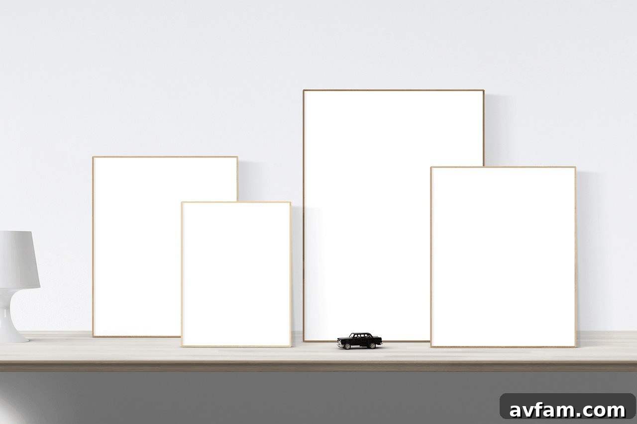
A gallery wall doesn’t require matching frames to read as cohesive. Visual consistency is more important than uniformity: keep gaps consistent, echo color or mat tones, and distribute visual weight across the arrangement.
Helpful starting points:
- Leave roughly 2–3 inches between neighboring frame edges for a unified look.
- Aim to position the center of the overall arrangement around 57–60 inches from the floor, then adjust for furniture and room proportions.
- Spread similar colors, frame weights, or visual tones across the composition rather than clustering them on one side.
Before making holes in the wall, arrange frames on the floor and move them until the grouping feels balanced. Then trace each frame onto paper or cardboard, tape the templates to the wall, and mark hanging points through the paper. This preparation prevents a row of misplaced nail holes and makes installation much easier.
Choose Mat Colors That Complement the Artwork
Mats create breathing room between the image and frame and help separate artwork from the wall color. White and off-white remain classics because they don’t compete with photographs or colorful prints. Darker mats like charcoal or navy add drama around lighter or brightly colored pieces but increase the visual weight of the frame.
For a subtle accent, use a double mat with a thin colored inner mat beneath a neutral outer mat. That narrow line of color can pick up a shade from the artwork without overwhelming it.
How High to Hang Art Above a Sofa
The sofa is a reliable reference for width and height. A grouping that spans roughly two-thirds of the sofa’s width usually looks balanced; a small print above a long sectional can appear lost. If you lack a single large piece, several smaller frames can achieve comparable visual weight.
For vertical spacing, leave about 6–8 inches between the top of the sofa back and the bottom of the artwork as a starting point, adjusting for tall sofas, large artworks, or low ceilings. The aim is for the art and sofa to read as a single composition rather than two separate elements.
Mixing Modern and Traditional Frames
Contrasting frame styles can be visually engaging. Pair a vintage gilded frame with a contemporary print to create a focal point, or use slim minimalist frames to soften the formality of traditional artwork. The key is to provide at least one shared detail—such as a consistent mat color, a repeated metal or wood tone, or a common visual accent—so the eye has a thread to follow.
- Pair ornate gold frames with clean white mats.
- Place slim metal frames next to carved wooden ones for contrast.
- Use the same mat color across different frame styles.
Light Your Framed Art Thoughtfully
Natural light shifts throughout the day, so consider how art will look in the evening as well as at noon. Picture lights above larger frames can emphasize texture and detail; LEDs are a safe choice because they emit little heat and minimal UV. For larger gallery walls, adjustable ceiling spots can offer flexible coverage.
Glare is an important concern. Anti-reflective or conservation-grade glazing reduces reflections and offers greater UV protection for sensitive prints and photographs. Even with protective glazing, avoid placing light-sensitive pieces in strong direct sunlight for prolonged periods.
Seasonal Swaps and Frame Maintenance
Rotating artwork or photos seasonally is an easy way to refresh a room. If you plan frequent swaps, ask your framer about easy-open backs such as turn buttons or flexible points to simplify changes.
For regular care, dust frames with a soft microfiber cloth. When cleaning glazing, apply cleaner to the cloth rather than spraying directly onto the frame to avoid moisture seeping into edges and damaging the artwork. Periodically check wires, hooks, and anchors—especially for heavier frames above seating—and tighten or replace hardware before any failure occurs.
Bringing It All Together
Framing a living room wall doesn’t require a perfectly matched set or obsessing over every millimeter. Some of the most appealing walls are assembled over time with family photos, prints, and artworks collected across years. What makes the display work is consistent attention to proportion, finishes that tie into the room, and careful spacing that lets each piece be seen.
Measure before you hang, test arrangements with paper templates, and use hardware suited to the weight and wall type. Once the practical details are handled, the room becomes a flexible canvas for personal expression.