
Downton Abbey’s Timeless Interior Colors: Bring Grandeur Home with Kelly-Moore Paints
Downton Abbey, the iconic British period drama set in the opulent early 1900s, captivated audiences worldwide with its compelling narratives, intricate character dynamics, and, perhaps most notably, its breathtaking visual splendor. From the majestic exterior of Highclere Castle to the meticulously decorated interiors, every scene offered a masterclass in Edwardian elegance and aristocratic style. What might have seemed an unlikely hit across the pond, Downton Abbey quickly became a cultural phenomenon in the States, drawing discerning viewers into a world of rich traditions, compelling drama, and undeniably gorgeous settings.
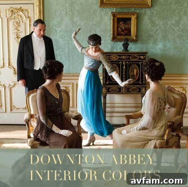
Beyond the upstairs-downstairs intrigues, one of the most resonant aspects of the show for many viewers has been the stunning interior design and the carefully chosen color palettes that define each space. The show’s production designers brilliantly utilized color to convey mood, status, and the very essence of the era. Whether it was the deep, commanding hues of the formal reception rooms or the lighter, more airy tones of the private chambers, the colors told a story all their own, weaving a tapestry of historical authenticity and emotional depth.
Unveiling the Downton Abbey Palette: A Collaboration with Kelly-Moore Paints
Recognizing the profound impact of Downton Abbey’s aesthetic, Kelly-Moore Paints, a distinguished name in the paint industry, took a remarkable initiative. Their esteemed designer, Mary Lawlor, embarked on a fascinating project: identifying and curating a specific palette of paints that meticulously matches the lush and historically accurate interiors so prominently featured throughout Downton Abbey. This unique collaboration allows enthusiasts and interior design aficionados alike to bring a piece of that grand British country house charm into their own homes, transforming ordinary spaces into extraordinary sanctuaries of sophistication.
The resulting collection is a testament to the show’s enduring influence and Kelly-Moore’s dedication to capturing timeless beauty. Mary Lawlor’s expert eye has distilled the essence of Downton’s decor into a versatile range of colors. These carefully selected interior colors encompass a spectrum of shades, from rich, deep reds that evoke grandeur and warmth, to classic wood-toned browns reminiscent of antique furnishings and ornate paneling. Complementing these are refreshing pastels and creamy whites, offering lightness and sophistication, all expertly grounded by utilitarian grays that speak to both practicality and understated elegance. Each hue is a direct echo of the amazing settings portrayed on the beloved show, offering a direct link to the world of the Crawleys and their household and inspiring a sense of historical continuity.
To further aid in this creative journey, Kelly-Moore Paints and Mary Lawlor have thoughtfully grouped these colors room by room, providing inspiration and guidance on how to achieve specific looks. Imagine transforming your own living spaces with the same sophistication seen in Downton’s grand halls, intimate drawing-rooms, or peaceful bedrooms. While a dynamic image browser cannot be directly embedded here, we have compiled a stunning gallery of color swatches and visual inspiration below to illustrate these magnificent tones. These images are designed to transport you directly to the heart of Downton Abbey, allowing you to visualize how these beautiful shades can come to life in your own environment and inspire your next decorating project.

Decoding Downton’s Hues: A Room-by-Room Inspiration Guide
The brilliance of Downton Abbey’s interiors lies not just in the individual colors but in their thoughtful application across different spaces. Each room serves a distinct purpose, and its color scheme reflects that functionality, emotional tone, and the social rituals performed within it. Let’s delve deeper into the types of colors identified by Mary Lawlor and explore how they might have been used within the grand estate, drawing inspiration for your own home.
The Allure of Rich, Deep Reds
Few colors convey opulence, formality, and passionate energy quite like a deep, saturated red. In the world of Downton Abbey, these majestic hues would typically grace the most formal and public areas: the grand dining room where lavish dinners were served, the drawing-room where guests conversed and relaxed, or the library, signifying intellectual pursuit, quiet contemplation, and a cozy, yet distinguished atmosphere. These reds speak of tradition, warmth, and a certain undeniable grandeur. Think of crimson velvets, intricate damasks, and polished mahogany – colors that demand attention and command respect. Incorporating such a shade can instantly elevate a room, creating a sense of history and luxurious comfort, perfect for an accent wall or an entire formal space.
The Earthy Elegance of Wood-Toned Browns
Browns are often the unsung heroes of period design, providing a stable, grounding backdrop that allows other elements to shine. Kelly-Moore’s wood-toned browns capture the essence of Downton’s extensive use of natural wood – from intricate wall paneling and imposing furniture to grand staircases and carved architectural details. These shades evoke a sense of heritage, stability, and natural beauty, connecting the interior to the timeless landscape outside. They are perfect for studies, libraries, or even hallways and foyers, where they can create a welcoming yet stately ambiance that feels both robust and refined. Paired with the deeper reds or softer creams, browns offer a balance that is both sophisticated and inviting, echoing the rustic charm of the British countryside blended seamlessly with aristocratic refinement.
Refreshing Pastels and Creamy Whites
Moving from the public, formal spaces to the more private, intimate areas of Downton, we encounter a distinct shift towards lighter, more refreshing pastels and creamy whites. These softer shades would have been prevalent in the ladies’ bedrooms, morning rooms, and perhaps even some of the quieter sitting areas designed for leisure and informal conversation. Pastels like soft blues, gentle greens, and muted yellows, combined with various creamy whites, create an atmosphere of serenity, elegance, and lightness. They reflect natural light beautifully, making rooms feel more spacious and airy, embodying a sense of gentle femininity and refined taste. These colors also perfectly complement the delicate floral patterns often found in Edwardian textiles and wallpapers, offering a soothing contrast to the more assertive colors found elsewhere in the house.
Utilitarian Grays: The Foundation of Functionality
While the lavishness of Downton Abbey often steals the spotlight, the everyday functionality of the estate was just as crucial, supported by the dedicated staff. Kelly-Moore’s utilitarian grays capture the practical elegance of the service areas – the bustling kitchen overseen by Mrs. Patmore, the hardworking servants’ quarters, laundries, and boot rooms. These grays are not stark or cold but possess a subtle warmth, providing a robust and unfussy backdrop that stands up to daily wear. They speak to the hardworking nature of the household and the timeless appeal of understated design. Used as a grounding neutral, these grays can anchor a room, allowing more vibrant colors to pop, or stand alone to create a minimalist yet sophisticated space. They remind us that even the most opulent homes require a foundation of practical and enduring design principles.
Bringing Downton Abbey Style Into Your Modern Home
You don’t need a sprawling estate to infuse your home with the timeless elegance of Downton Abbey. Mary Lawlor’s curated palette from Kelly-Moore Paints provides the perfect starting point for recreating this iconic style, whether you’re undertaking a full renovation or simply looking to refresh a single room. Here are some ideas to consider for incorporating these exquisite shades into your contemporary living spaces:
- Accent Walls: If deep reds feel too bold for an entire room, consider an accent wall in a rich crimson or burgundy. Pair it with a creamy white or a warm gray on the other walls to create a striking focal point without overwhelming the space, adding drama and sophistication.
- Bedrooms of Serenity: Embrace the softer pastels and creams for bedrooms. A gentle sage green or a delicate lavender can create a restful and luxurious sanctuary, reminiscent of Lady Mary or Lady Edith’s private chambers, promoting calm and elegance.
- Inviting Dining Rooms: Use the wood-toned browns as a base for your dining area. Consider deep brown wainscoting with a lighter, yet still traditional, color above, or simply select a rich brown for the walls to evoke a sense of formal elegance ideal for entertaining and creating a cozy, sophisticated atmosphere.
- Kitchen Charm: For a touch of the utilitarian grace seen in Mrs. Patmore’s kitchen, opt for one of the sophisticated grays. These can be beautifully complemented by white or cream cabinetry and natural wood accents, creating a functional yet stylish culinary space.
- Accessorize Wisely: Beyond paint, incorporate elements like velvet cushions, antique-inspired lamps, ornate mirrors, and dark wood furniture to complete the look. Don’t be afraid to mix and match textures and patterns, just as they did in the Edwardian era, to add depth and character.
- Focus on Natural Light: Downton Abbey spaces often made the most of natural light. Choose lighter sheer curtains or blinds where possible to allow sunlight to highlight your chosen paint colors, enhancing their vibrancy and bringing a sense of airiness to the room.
The beauty of this palette is its versatility. You can go full Edwardian glamour or simply borrow elements to add a touch of historical sophistication to a contemporary setting. The key is to select colors that resonate with you and create an atmosphere of refined comfort, making your home a true reflection of your appreciation for classic design.
The Enduring Legacy of Downton Abbey in Home Decor
Downton Abbey has not only entertained millions but has also profoundly influenced interior design trends, sparking a renewed appreciation for classic elegance, historical accuracy, and the thoughtful use of color. The show reminded us that homes are not just structures but living narratives, reflecting the personalities, aspirations, and histories of those who inhabit them. The collaboration between Downton Abbey’s visual legacy and Kelly-Moore Paints, championed by Mary Lawlor, ensures that this rich aesthetic can continue to inspire and grace our modern living spaces, offering a tangible connection to a cherished era.
Whether you’re a devoted fan or simply someone who appreciates timeless design, exploring these exquisite paint palettes offers a unique opportunity to connect with a beloved era. It’s an invitation to infuse your surroundings with a sense of history, character, and unparalleled beauty, making your home truly feel like a sanctuary of sophistication and personal style.
We are eager to hear your thoughts! Which of these magnificent Downton Abbey-inspired colors are your favorite, and how do you envision incorporating them into your own home? Share your ideas and inspiration in the comments below, and let’s continue the conversation about timeless design!
For even more delightful insights and inspiration on the decor, design, and fashion that defined the world of Downton Abbey, be sure to visit GregoryHan.com. Explore further into the intricate details that brought this unforgettable period to life and continue your journey into Edwardian elegance.